
Apple: iPhone News and Discussion Thread

Team Owner


Joined: Feb 2002
Posts: 28,445
Likes: 1,576
From: Miami, FL
BTW read an article that the fingerprint scanner was having trouble working with the coating material causing delay
http://www.telegraph.co.uk/technolog...t-scanner.html
http://www.telegraph.co.uk/technolog...t-scanner.html

I noticed when in spot light search it saves old deleted text messages. I know how to turn this feature off but want to know how to permanently delete deleted messages. Are deleted pictures and video saved somewhere also? If I do the reset were the media and data is not deleted will that work?
Moderator
Joined: Oct 2004
Posts: 64,144
Likes: 3,391
From: Not Las Vegas (SF Bay Area)
so WWDC is monday,
these are the rumors for iOS 7
these are the rumors for iOS 7
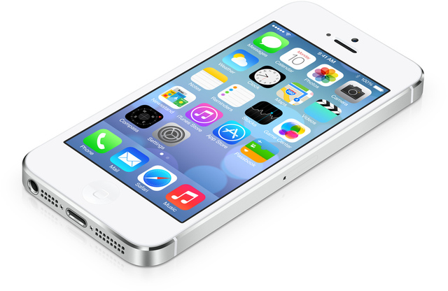
iOS 7
iOS 7 will almost certainly make its consumer debut alongside updated iPhone hardware later this year, but WWDC will offer the first glimpse of the upcoming software and Apple should spend a fair amount of the keynote walking through the changes. Apple will also begin seeding versions of iOS 7 to developers at WWDC, giving them time to help test the operating system itself and to build and update their own apps to take advantage of new features coming in iOS 7.
The big discussion surrounding iOS 7 has been regarding a new "flat design" driven by Jony Ive, who took over control of Apple's software-focused Human Interface team late last year in addition to his longtime role as head of Industrial Design. Prominent rumors for iOS 7 include:
- Image of 'Flat' Redesign From Early iOS 7 Build Reportedly Leaks
- iOS 7 May Include AirDrop Wireless File Sharing Capabilities
- More Details on Jony Ive's Flat iOS 7 Design: Heavier on Black and White
- Apple to Expand Social Network Integration in iOS 7 with Support for Flickr and Vimeo
- Surge in Apple's iOS 7 Usage Revealed in Web Traffic Stats
- Apple Engineers Working Overtime on iOS 7's 'DeForstallization'
- Apple Looking to Boost In-Car Integration of Maps and Siri in iOS 7
- Details on Jony Ive's 'Very, Very Flat' Design for iOS 7
- iOS 7 Running Behind, Rumored to Have Significant Visual Makeover
 Maybe its just more irritating as I interact with iOS every few minutes of every single day.
Love keynote day. Hoping for new time capsule as my router is on the frits and I've been holding off replacing it hoping for AC to be added. Oh and new Mba's if I can get mine sold for a reasonable amount. While excited for iOS7 waiting until sept for it to be released will suck.
 Currently watching this and Xbox e3 keynote at the same time...

Moderator
Joined: Oct 2004
Posts: 64,144
Likes: 3,391
From: Not Las Vegas (SF Bay Area)
11:56 am Activation Lock: If a thief tries to turn off Find My iPhone, or if they wipe the device entirely, they won't be able to use it.
Team Owner
Joined: Jan 2001
Posts: 25,967
Likes: 2,685
From: Jersey
Sanest Florida Man


Joined: Aug 2007
Posts: 46,092
Likes: 11,837
From: Florida
Also what will the premium be that they charge for it? $300 like bwm apps or even more? I could see them charging a handsome sum for the feature.
nnInn
Joined: Mar 2006
Posts: 37,670
Likes: 1,084
love the car app, the question is how long will it take the auto makers and their interior packaging engineers to get their heads around it and launch the product in new vehicles.....Siri eyes free is really just starting to hit the dealers so I think this will take awhile to hit the showroom unfortunately. But it's a step in the right direction for sure. I'm hoping that on the list of automarkers apple provided they have been working ahead to get this out sooner than later.
Also what will the premium be that they charge for it? $300 like bwm apps or even more? I could see them charging a handsome sum for the feature.
Also what will the premium be that they charge for it? $300 like bwm apps or even more? I could see them charging a handsome sum for the feature.
likely on a car nobody wants. i.e chevy sonic etc. question is how long for it to get wide spread and be in civics/corollas and the like, or is this going to be a premium feature alongside a $2k upgrade in luxo barges.. time will tell I suppose.
Nom Nom Nom Nom
Joined: Aug 2003
Posts: 11,801
Likes: 76
From: Universal City
Soooo a facelift on an existing OS with some functionality that should have been in there YEARS ago and hardly a mention of the lockscreen/notification center.. 
Hope some more info trickles out. As it stands now, Ill wait for JB iOS7, until then, ill stay on 6.
Hope some more info trickles out. As it stands now, Ill wait for JB iOS7, until then, ill stay on 6.

Suzuka Master
Joined: Jan 2009
Posts: 9,012
Likes: 439
From: SoCal
In my mind ios7 definitely looks better other than the dialer app. That thing looks ugly.
5heir notification center doesnt look like a joke anymore. Think the biggest thong missong is default apps. That is one thing that could make me consider switching from android.
As for the car apps... If manufacturers go woth apple maps be scared...
Siri looks nice. But bing search... Hopefully you guys can change that
nnInn
Joined: Mar 2006
Posts: 37,670
Likes: 1,084
In my mind ios7 definitely looks better other than the dialer app. That thing looks ugly.
5heir notification center doesnt look like a joke anymore. Think the biggest thong missong is default apps. That is one thing that could make me consider switching from android.
As for the car apps... If manufacturers go woth apple maps be scared...
Siri looks nice. But bing search... Hopefully you guys can change that
5heir notification center doesnt look like a joke anymore. Think the biggest thong missong is default apps. That is one thing that could make me consider switching from android.
As for the car apps... If manufacturers go woth apple maps be scared...
Siri looks nice. But bing search... Hopefully you guys can change that
Sanest Florida Man
Joined: Aug 2007
Posts: 46,092
Likes: 11,837
From: Florida
The design of iOS 7: simply confusing
The new iOS is better and worse all at once
By Joshua Topolsky
What I saw today at Apple's annual WWDC event in the new iOS 7 was a radical departure from the previous design of the company's operating system � what CEO Tim Cook called "a stunning new user interface." But whether this new design is actually good design, well, that's a different story entirely.
Apple did indeed tout a completely rethought mobile OS, one which isn't technically a great distance from its predecessor, but is an incredible deviation on design. Gone are lush, skeuomorphic objects, dials, and textures (in fact, Apple took several potshots at itself about the faux-felt and wood textures of the iOS of yesteryear). Instead, they have been replaced with stark, largely white and open app spaces; colorful, almost child-like icons; pencil thin, abstract controls for settings. New, Gaussian blur-transparency layers slide over your content, creating thick smears of soft color; notifications and other incidental information floats above your work area on semi-translucent panels.
THE ICONS ARE THE FIRST MISSTEPS IN APPLE'S NEW APPROACH
The icons are striking to see, and the first sign that there are points of confusion and even missteps in Apple's new approach. For starters, the icon styles wildly vary from app to app. Game Center is now a collection of 3D globs, rendered together against a white background, while the Camera icon recalls something more like clip-art � an icon that seems to want to be more abstract than it is, set against a rudimentary gray gradient. It looks shockingly basic, and not elegant, but childish. The same goes for Weather, an amateur mishmash of sun, clouds, and gradient background that was highlighted as part of Apple's new "grid system." It might be on a grid, but it doesn't look very good. The Maps icon is a mess, too many colors and lines intersecting at once. Messages' word balloon is so puffed up and oversized compared to its fine point that it looks like it will topple over. Another journalist remarked to me that the Settings icon looked more like an oven burner than a set of gears. I agreed, and still do now as I sit looking at it. It looks like clip-art of an oven burner, and again, that lazy gradient isn't doing the icon any favors.
AGAIN APPLE SEEMS TO IGNORE THE UTILITY OF GLANCEABLE INFORMATION
But with the icons, there's an enormous feeling that Apple's designers couldn't decide on a direction. And for all the jokes about skeumorphism, I would have preferred something nearer to the company's previous efforts than the new set, which seem closer to bathroom signage than even Windows Phone in their plainness.
It's not just that the icons on the homescreen feel and look like the work of a lesser designer. They also vary across the system. For instance, the camera icon is a different shape in other sections of the OS like the camera app or the lockscreen. Shouldn't there be some consistency?
Elsewhere there is trouble � instead of correcting issues with the notification panel and alerts, Apple has simply given them a fresh coat of paint and several layers of sub-navigation. Your notifications will still interrupt your work at the top of the screen, and when you slide down the panel you're now presented with options to flip between the kinds of notifications you want to see. Even closing notifications looks harder, the small "X" box now nearly invisible against that soft blur background. But fundamentally these are unimproved from Apple's last attempt, offering no action to take (which the company did actually just add to the forthcoming version of OS X), and doing nothing to actually speed up your productivity on the device.
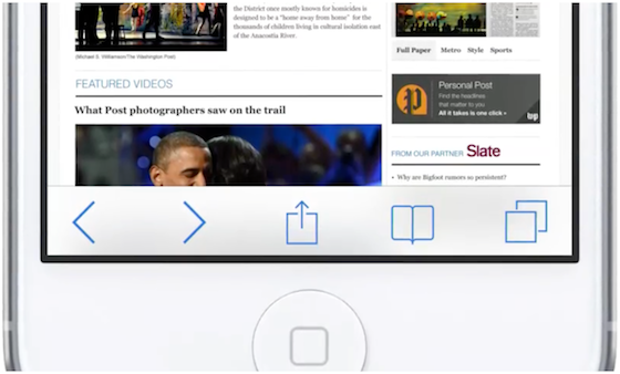
Inside apps, iconography has been transported from the familiar, to the confusing. Take a look at those new controls in Safari. What's that box with the arrow on top of it? It appears to be your sharing options, but it doesn't look like any sharing icon you know. It's almost as if in an attempt to move away from familiar shapes and textures, Apple has confused its design with new shapes and textures � weird ones. Less useful ones.
But it's not all a loss, or a miss. In fact, there are some extremely beautiful aspects of iOS 7 � aspects that lead me to believe that the raw materials for a more cohesive and useful OS are there, if perhaps a little buried.
THE RAW MATERIALS ARE THERE, IF PERHAPS BURIED
The typography in the majority of the apps is gorgeous, leaning heavily into Helvetica Neue, and putting an emphasis on bigger, more readable type. App redesigns from the Calendar to the Camera introduce welcome changes. A new multitasker finally gets it right with what amounts to a carbon copy of the webOS card methodology. Little changes like the subtle, gyroscope-responsive parallax wallpapers, the ability to open notifications and controls on your lockscreen, and the new back gesture within apps show that Apple is still invested in the tiniest details.
Apple is showing that it can adapt, borrow, and tweak ideas from the competition. That it can expand what iOS feels and looks like, as well as what it can do. The problem now is that it seems to be buckling a bit under the weight of an end-to-end redesign. I'm hopeful that in the next few months as Apple ramps up for the introduction of new hardware at its fall event, some of the design and functionality issues that have yet to be addressed will be nipped and tucked. And perhaps the designers and engineers in Cupertino will revisit simply bad design decisions, like those obstructing notifications or the cluttered Control Center.
Until then, however, at least Apple fans and foes have something new to argue about.
http://www.theverge.com/apple/2013/6...mply-confusing
The new iOS is better and worse all at once
By Joshua Topolsky
What I saw today at Apple's annual WWDC event in the new iOS 7 was a radical departure from the previous design of the company's operating system � what CEO Tim Cook called "a stunning new user interface." But whether this new design is actually good design, well, that's a different story entirely.
Apple did indeed tout a completely rethought mobile OS, one which isn't technically a great distance from its predecessor, but is an incredible deviation on design. Gone are lush, skeuomorphic objects, dials, and textures (in fact, Apple took several potshots at itself about the faux-felt and wood textures of the iOS of yesteryear). Instead, they have been replaced with stark, largely white and open app spaces; colorful, almost child-like icons; pencil thin, abstract controls for settings. New, Gaussian blur-transparency layers slide over your content, creating thick smears of soft color; notifications and other incidental information floats above your work area on semi-translucent panels.
THE ICONS ARE THE FIRST MISSTEPS IN APPLE'S NEW APPROACH
The icons are striking to see, and the first sign that there are points of confusion and even missteps in Apple's new approach. For starters, the icon styles wildly vary from app to app. Game Center is now a collection of 3D globs, rendered together against a white background, while the Camera icon recalls something more like clip-art � an icon that seems to want to be more abstract than it is, set against a rudimentary gray gradient. It looks shockingly basic, and not elegant, but childish. The same goes for Weather, an amateur mishmash of sun, clouds, and gradient background that was highlighted as part of Apple's new "grid system." It might be on a grid, but it doesn't look very good. The Maps icon is a mess, too many colors and lines intersecting at once. Messages' word balloon is so puffed up and oversized compared to its fine point that it looks like it will topple over. Another journalist remarked to me that the Settings icon looked more like an oven burner than a set of gears. I agreed, and still do now as I sit looking at it. It looks like clip-art of an oven burner, and again, that lazy gradient isn't doing the icon any favors.
Multitasking, tabs, Control Center, AirDrop, and general interactions are looking fantastic in iOS 7. But wow, the ugly stick.
� Jason Santa Maria (@jasonsantamaria) June 10, 2013
Weirdly, though there wasn't any mention of active icons in iOS 7, the calendar displays the correct date (as it always has), while the clock icon is updated with the current time in all the screenshots we've seen. Weather, however, frustratingly remains unchanged. Don't even get me started on weather. Okay, fine. Again Apple seems to ignore the utility of glanceable information, keeping safely to an annoying dance of swipes and secret menus to get to basic information... like the current temperature.� Jason Santa Maria (@jasonsantamaria) June 10, 2013
AGAIN APPLE SEEMS TO IGNORE THE UTILITY OF GLANCEABLE INFORMATION
But with the icons, there's an enormous feeling that Apple's designers couldn't decide on a direction. And for all the jokes about skeumorphism, I would have preferred something nearer to the company's previous efforts than the new set, which seem closer to bathroom signage than even Windows Phone in their plainness.
It's not just that the icons on the homescreen feel and look like the work of a lesser designer. They also vary across the system. For instance, the camera icon is a different shape in other sections of the OS like the camera app or the lockscreen. Shouldn't there be some consistency?
Elsewhere there is trouble � instead of correcting issues with the notification panel and alerts, Apple has simply given them a fresh coat of paint and several layers of sub-navigation. Your notifications will still interrupt your work at the top of the screen, and when you slide down the panel you're now presented with options to flip between the kinds of notifications you want to see. Even closing notifications looks harder, the small "X" box now nearly invisible against that soft blur background. But fundamentally these are unimproved from Apple's last attempt, offering no action to take (which the company did actually just add to the forthcoming version of OS X), and doing nothing to actually speed up your productivity on the device.
iOS7 will probably be really awesome when they do the visual design.
� Tom Coates (@tomcoates) June 10, 2013
The Control Center, a new option which can be summoned with a quick swipe up from the bottom of the screen is actually a great idea, but its design and organization of items is bizarre. It is an odd, jarring collection of functions. Toggles for oft-used controls, a brightness bar, a music player? AirDrop accessibility? A flashlight app? The clock? It feels like for lack of a better location Apple lumped all the other stuff into a single, messy space that floats above your onscreen content, making the already busy utility a visual strain. The idea is good, the execution is troubling.� Tom Coates (@tomcoates) June 10, 2013
Inside apps, iconography has been transported from the familiar, to the confusing. Take a look at those new controls in Safari. What's that box with the arrow on top of it? It appears to be your sharing options, but it doesn't look like any sharing icon you know. It's almost as if in an attempt to move away from familiar shapes and textures, Apple has confused its design with new shapes and textures � weird ones. Less useful ones.
But it's not all a loss, or a miss. In fact, there are some extremely beautiful aspects of iOS 7 � aspects that lead me to believe that the raw materials for a more cohesive and useful OS are there, if perhaps a little buried.
THE RAW MATERIALS ARE THERE, IF PERHAPS BURIED
The typography in the majority of the apps is gorgeous, leaning heavily into Helvetica Neue, and putting an emphasis on bigger, more readable type. App redesigns from the Calendar to the Camera introduce welcome changes. A new multitasker finally gets it right with what amounts to a carbon copy of the webOS card methodology. Little changes like the subtle, gyroscope-responsive parallax wallpapers, the ability to open notifications and controls on your lockscreen, and the new back gesture within apps show that Apple is still invested in the tiniest details.
Apple is showing that it can adapt, borrow, and tweak ideas from the competition. That it can expand what iOS feels and looks like, as well as what it can do. The problem now is that it seems to be buckling a bit under the weight of an end-to-end redesign. I'm hopeful that in the next few months as Apple ramps up for the introduction of new hardware at its fall event, some of the design and functionality issues that have yet to be addressed will be nipped and tucked. And perhaps the designers and engineers in Cupertino will revisit simply bad design decisions, like those obstructing notifications or the cluttered Control Center.
Until then, however, at least Apple fans and foes have something new to argue about.
Suzuka Master
Joined: Jan 2009
Posts: 9,012
Likes: 439
From: SoCal
Umm yea it should be google. They're the number 1 search for a reason...
Trust me I've tried the bing challenge too. And I've picked google pretty much every single time. Also with Google's knowledge graph, it is much stronger than Bing. Although most of those question can probably be answered by siri.
Google is much better at search than bing. And yahoo.
Btw, I like iOS7. Everything they've pretty much been behind in they've caught up.
Sanest Florida Man
Joined: Aug 2007
Posts: 46,092
Likes: 11,837
From: Florida
Apple Takes Another Step Away From Google With Bing Integration In iOS 7
http://www.cultofmac.com/231133/appl...tion-in-ios-7/

During today’s WWDC keynote, Apple’s Eddy Cue briefly mentioned Bing integration in iOS 7. While demoing new features in Siri, Cue mentioned that Bing is used to power web searches. Nothing was said about Google, and that shouldn’t come as a surprise.
Apple has been distancing itself from Google for quite some time. For instance, Apple Maps is now on iOS and OS X. Bing integration in Siri, while a more subtle move, is definitely a knife jab at Google. And Microsoft couldn’t be happier.
Siri is already a Google search replacement in the sense that it uses services like Wolphram Alpha and Yelp to answer certain kinds of questions. In iOS 6, Siri uses your default search engine in Safari to show web results (Google, Yahoo, and Bing are options). Apple’s mention of Bing today in relation to iOS 7’s Siri indicates that Microsoft will be the default search provider no matter the engine you have set as your default.
“Starting this fall with iOS 7, Bing will power Siri’s new integrated web search,” according to the official Bing blog. “We are thrilled that all the great results people have come to know and love on Bing.com will now be available to Siri users on iPhone, iPad and iPod touch.”
The partnership is ironic when you consider that Microsoft just started airing Windows 8 tablet ads that use Siri to mock Apple products.
We’ve reached out to Apple for clarification on how Bing integration works in iOS 7. Apple would never completely remove Google as a search provider, right?
Sanest Florida Man
Joined: Aug 2007
Posts: 46,092
Likes: 11,837
From: Florida
