
Post Processing Thread

Thread Starter
Racer
Joined: Oct 2003
Posts: 260
Likes: 0
From: Los Angeles, CA
Post Processing Thread
Okay coming from the Lightroom thread, it seems that a general post processing thread is needed for us noobs who have alot of post processing questions. So instead of going off topic in the other threads, here's a thread for everything and anything regarding post processing photos. Whether it's Lightroom or Photoshop or any other software, ask all your post processing questions here.
Also, since some of us are quite new at this, it would also be a great place to show our work and have people give critiques on them to help point us in the right direction. Most of the time we don't have people with experience around us to help guide us in the right path. We normal show our work to people who think photos from point and shoots with blownout flash shots looks great. So since there is alot of people here with quite alot of experience, we can get much better advise from them. You should post a before and after shot so we can see what you did.
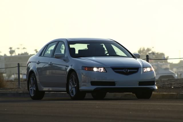
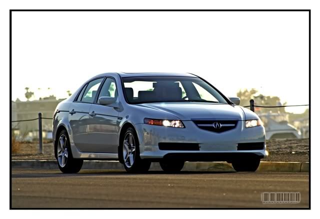
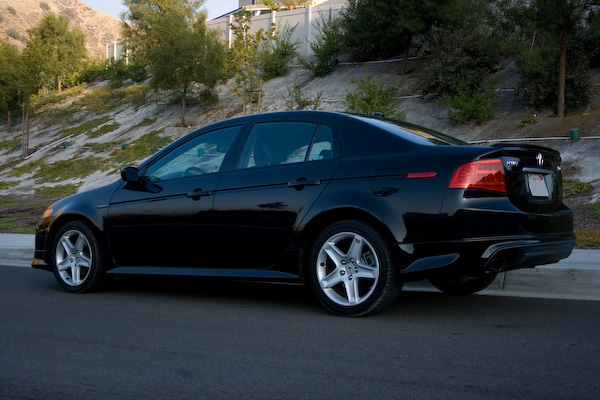
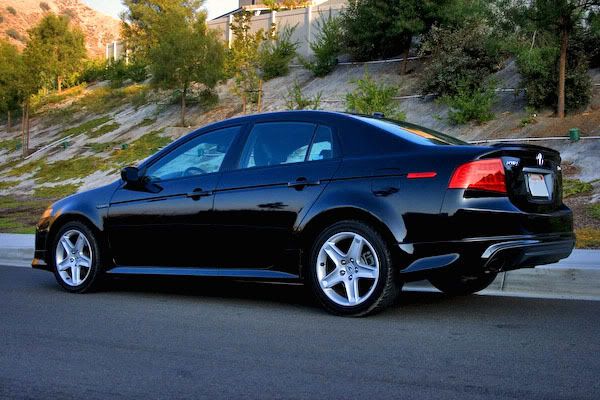
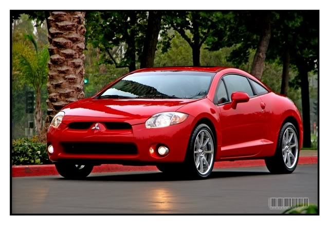
I'll start with a new photo instead of the RL shot that was really difficult to deal with. This time it's with my old TL. Again, this shot I took on my way to work. I didn't have alot of time so I just snapped some photos before I trade it in that same day. I just wanted a momento of it before parting with it. I used Lightroom to process this photo. Let me know what you think. How else can I improve it?
Before
<a href="http://www.flickr.com/photos/pgayatin/452033255/" title="Photo Sharing"><img src="http://farm1.static.flickr.com/190/452033255_491fe27ec0_o.jpg" width="600" height="400" alt="My 04 Acura TL (Unprocessed)" /></a>
After
<a href="http://www.flickr.com/photos/pgayatin/452033253/" title="Photo Sharing"><img src="http://farm1.static.flickr.com/220/452033253_0363b9243b_o.jpg" width="600" height="400" alt="My 04 Acura TL" /></a>
Also, since some of us are quite new at this, it would also be a great place to show our work and have people give critiques on them to help point us in the right direction. Most of the time we don't have people with experience around us to help guide us in the right path. We normal show our work to people who think photos from point and shoots with blownout flash shots looks great. So since there is alot of people here with quite alot of experience, we can get much better advise from them. You should post a before and after shot so we can see what you did.
I'll start with a new photo instead of the RL shot that was really difficult to deal with. This time it's with my old TL. Again, this shot I took on my way to work. I didn't have alot of time so I just snapped some photos before I trade it in that same day. I just wanted a momento of it before parting with it. I used Lightroom to process this photo. Let me know what you think. How else can I improve it?
Before
<a href="http://www.flickr.com/photos/pgayatin/452033255/" title="Photo Sharing"><img src="http://farm1.static.flickr.com/190/452033255_491fe27ec0_o.jpg" width="600" height="400" alt="My 04 Acura TL (Unprocessed)" /></a>
After
<a href="http://www.flickr.com/photos/pgayatin/452033253/" title="Photo Sharing"><img src="http://farm1.static.flickr.com/220/452033253_0363b9243b_o.jpg" width="600" height="400" alt="My 04 Acura TL" /></a>


Safety Car
Joined: Aug 2004
Posts: 4,197
Likes: 16
From: NJ
Good thread....will post examples later.
From a pp standpoint, the tl shot came out pretty good. It is interesting to see the kind of border you used. The only thing I will mention is that the highlight area on the top left lost significant amount of detail in the after shot. That shouldn't be an issue since your subject improved very much and you want the viewers to look at your subject, not the background.
From a pp standpoint, the tl shot came out pretty good. It is interesting to see the kind of border you used. The only thing I will mention is that the highlight area on the top left lost significant amount of detail in the after shot. That shouldn't be an issue since your subject improved very much and you want the viewers to look at your subject, not the background.
Moderator Alumnus


Joined: Mar 2002
Posts: 64,207
Likes: 14,347
I would have to agree with badboy that the PP looks pretty good, aside from the top-left area that got washed out. Also the taillight is overdone, causing it to not look good. To combat that, bring down any of the following - usually you only have to do one: Fill light, Saturation (only a little), Brightness, Contrast, Exposure. Just do it enough so you get a good portion of the taillight detail back. It shouldn't be too hard to tell when you have found the threshold. This is assuming you are using LR.
Again if you are using LR, use the comparison button (XY) to spot-check the differences between the original and the PP and look at all the areas to see how they have changed. That will help immensely with the 2 above issues.
Again though, I think the pic you are starting off with is making it tough. It's a bad, unflattering angle of the car. Consequently, you can PP it as much as you want but its never going to be a really good picture. I realize you didn't have a lot of time taking the pics though. Just saying.
Thread Starter
Racer
Joined: Oct 2003
Posts: 260
Likes: 0
From: Los Angeles, CA
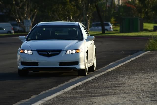
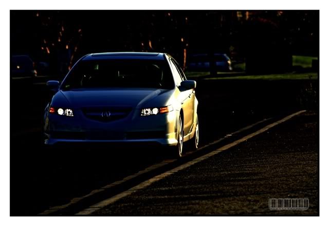
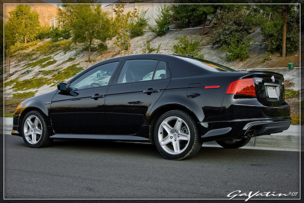
Thanks for the input guys. I went back to make the changes to the photo and it seems like it was one of those photos that I syncronized with another photo from Lightroom. So I redid it from scratch. Here's what I came up with. Let me know what you guys think.
<a href="http://www.flickr.com/photos/pgayatin/452868494/" title="Photo Sharing"><img src="http://farm1.static.flickr.com/198/452868494_7fdd2b35b5_o.jpg" width="600" height="400" alt="My 04 Acura TL (Edit)" /></a>
Yeah, I will have to spend some time one day and do a real photo shoot. But I should always shoot with composition in mind.
<a href="http://www.flickr.com/photos/pgayatin/452868494/" title="Photo Sharing"><img src="http://farm1.static.flickr.com/198/452868494_7fdd2b35b5_o.jpg" width="600" height="400" alt="My 04 Acura TL (Edit)" /></a>
Originally Posted by srika
Again though, I think the pic you are starting off with is making it tough. It's a bad, unflattering angle of the car. Consequently, you can PP it as much as you want but its never going to be a really good picture. I realize you didn't have a lot of time taking the pics though. Just saying.
Thread Starter
Racer
Joined: Oct 2003
Posts: 260
Likes: 0
From: Los Angeles, CA
Originally Posted by badboy
Good thread....will post examples later.
...It is interesting to see the kind of border you used.
...It is interesting to see the kind of border you used.
Trending Topics
Moderator Alumnus
Joined: Mar 2002
Posts: 64,207
Likes: 14,347
Originally Posted by guia x
Thanks for the input guys. I went back to make the changes to the photo and it seems like it was one of those photos that I syncronized with another photo from Lightroom. So I redid it from scratch. Here's what I came up with. Let me know what you guys think.
Moderator Alumnus
Joined: Mar 2002
Posts: 64,207
Likes: 14,347
Originally Posted by guia x
Great, I look forward to seeing your examples. About the border, I created an action that applies the border in photoshop and I batch process my images with it. I got the idea for the border from one of the users here. I can't remember his username.
Big Block go VROOOM!
Joined: Oct 2003
Posts: 8,578
Likes: 1
From: Chicago Burbs
I played around a little but with guia's TL shot. One thing that I think I would personally attack on it is the sky reflection in the paint. IMO, it would help the look of the car if blue cast in that's being picked up in that area is reduced.
Drifting
Joined: Oct 2006
Posts: 2,683
Likes: 213
From: CA
I tried doing a quickie on your TL, its not much, but I think its influenced with how I want my pictures to come out.
for comparison:
before:
after:
I usually post process with emphasis on detail, sometimes at the expense of looking a bit dark.
for comparison:
before:
after:
I usually post process with emphasis on detail, sometimes at the expense of looking a bit dark.
Thread Starter
Racer
Joined: Oct 2003
Posts: 260
Likes: 0
From: Los Angeles, CA
Originally Posted by srika
That looks a lot better man. LR can be tricky with that sync stuff, you have to be careful. I have about 20 custom presets in there that I use to start off with, based on the kind of pic. But sometimes its best to start off from scratch and I do that too if I can't find one thats a good fit right off the bat.
Originally Posted by srika
I like that border effect too.
Originally Posted by Billiam
I played around a little but with guia's TL shot. One thing that I think I would personally attack on it is the sky reflection in the paint. IMO, it would help the look of the car if blue cast in that's being picked up in that area is reduced.
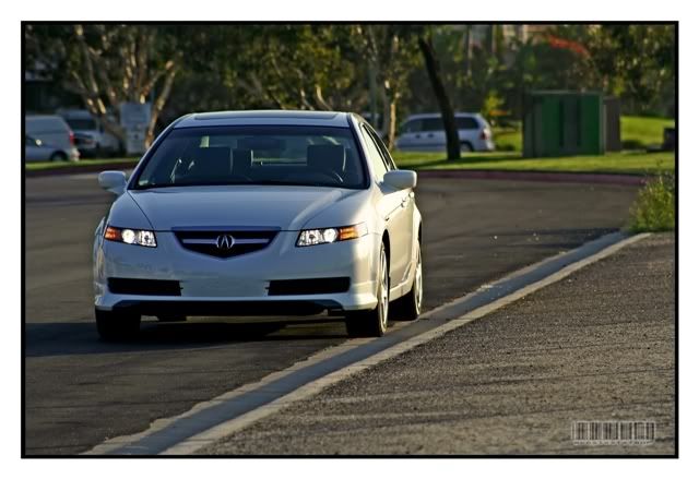
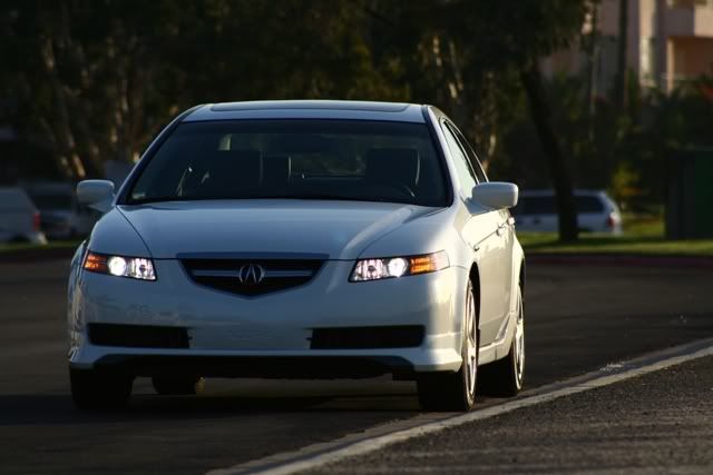
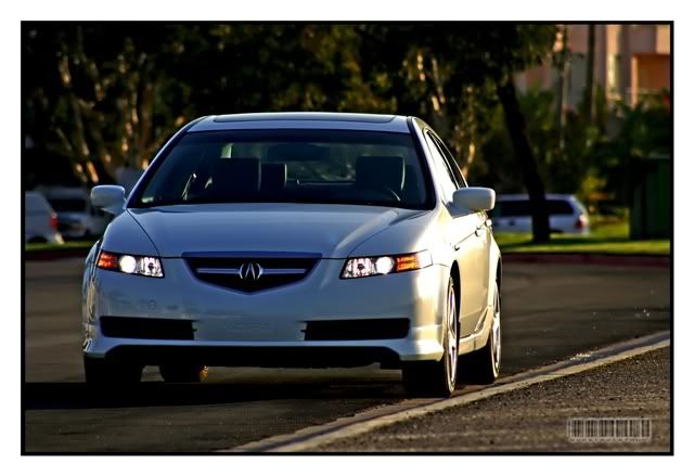
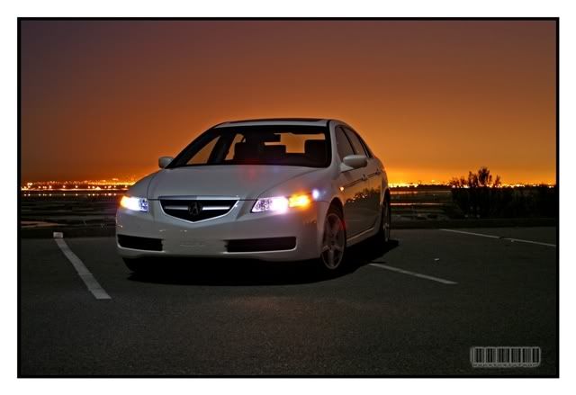
<a href="http://www.flickr.com/photos/pgayatin/453079139/" title="Photo Sharing"><img src="http://farm1.static.flickr.com/186/453079139_80dcfd7168_o.jpg" width="600" height="400" alt="My 04 Acura TL" /></a>
Originally Posted by sixsixfour
I tried doing a quickie on your TL, its not much, but I think its influenced with how I want my pictures to come out.
I usually post process with emphasis on detail, sometimes at the expense of looking a bit dark.
I usually post process with emphasis on detail, sometimes at the expense of looking a bit dark.
Moderator Alumnus
Joined: Mar 2002
Posts: 64,207
Likes: 14,347
Originally Posted by guia x
<a href="http://www.flickr.com/photos/pgayatin/453079139/" title="Photo Sharing"><img src="http://farm1.static.flickr.com/186/453079139_80dcfd7168_o.jpg" width="600" height="400" alt="My 04 Acura TL" /></a>
Thread Starter
Racer
Joined: Oct 2003
Posts: 260
Likes: 0
From: Los Angeles, CA
Originally Posted by srika
That looks a lot better. Notice it doesn't look as "plasticky" as your first one. I would have to agree that you have got it very close to looking as good as it can look.
Now I'd like to read people's opinions on sixsixfour's work. I can't really say that there is anything else that can be improved. I like the style. I'd would just like to hear what people with more experienced eyes have to say. Only thing I see might be the first photo when the sky looks blown out. A color gradient would probably make it better. I always hear blown out highlights are a 'no, no'. Anyway, to me they look perfect but it would be good to know if it's not so I could train my eyes what else to watch out for.
Safety Car
Joined: Aug 2004
Posts: 4,197
Likes: 16
From: NJ
I also think this is very close to looking it's best. Took the link out to avoide the blue link border, it looks much better this way.
<a href="http://www.flickr.com/photos/pgayatin/453079139/" title="Photo Sharing"><img src="http://farm1.static.flickr.com/186/453079139_80dcfd7168_o.jpg" width="600" height="400" alt="My 04 Acura TL" /></a>
<a href="http://www.flickr.com/photos/pgayatin/453079139/" title="Photo Sharing"><img src="http://farm1.static.flickr.com/186/453079139_80dcfd7168_o.jpg" width="600" height="400" alt="My 04 Acura TL" /></a>
Drifting
Joined: Oct 2006
Posts: 2,683
Likes: 213
From: CA
Originally Posted by guia x
It looks amost similar to my previous attempt. I like your TL photos much better. It goes to show, when you start out with something already great, it just gets better.

Drifting
Joined: Oct 2006
Posts: 2,683
Likes: 213
From: CA
here are a couple more pre- and post processing pictures Ive taken:
before:
after:
now that shot was taken at a moonlit night, using ambient lighting (clear sky w/ stars and a bright moon, and the port city of Long Beach providing the orange glow in the background). all I did for PP is boost the available light, show more details, while trying to preserve the existing colors.
these are from a shoot I did for a local Mitsu dealer just before the current Eclipse was released. all were taken with a 3MP Canon S1 IS camera.
before:
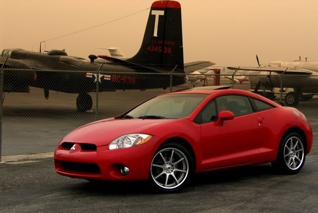
after:
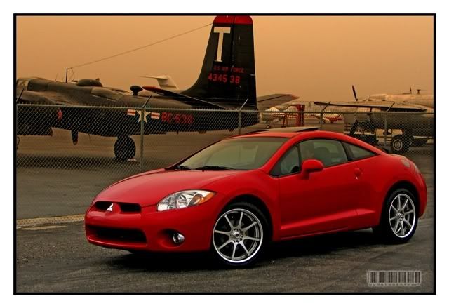
before:
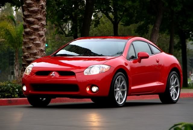
after:
any questions/critiques welcome!
before:
after:
now that shot was taken at a moonlit night, using ambient lighting (clear sky w/ stars and a bright moon, and the port city of Long Beach providing the orange glow in the background). all I did for PP is boost the available light, show more details, while trying to preserve the existing colors.
these are from a shoot I did for a local Mitsu dealer just before the current Eclipse was released. all were taken with a 3MP Canon S1 IS camera.
before:
after:
before:
after:
any questions/critiques welcome!
Drifting
Joined: Oct 2006
Posts: 2,683
Likes: 213
From: CA
guia x
with regard to the shot you took, and the way you PP'd it, I think you have a good balance on the shot. my only gripe (at least with the pp'd one) is that the reflection on the tail lamp got emphasized more than it should have been (the original pic has much more detail on the rear lamp). overall, i really like it - the combination of composition, the angle with which the car was shot, and the *flattery* induced by the background.
with regard to the shot you took, and the way you PP'd it, I think you have a good balance on the shot. my only gripe (at least with the pp'd one) is that the reflection on the tail lamp got emphasized more than it should have been (the original pic has much more detail on the rear lamp). overall, i really like it - the combination of composition, the angle with which the car was shot, and the *flattery* induced by the background.
Thread Starter
Racer
Joined: Oct 2003
Posts: 260
Likes: 0
From: Los Angeles, CA
Originally Posted by badboy
I also think this is very close to looking it's best. Took the link out to avoide the blue link border, it looks much better this way.
Originally Posted by sixsixfour
guia x
with regard to the shot you took, and the way you PP'd it, I think you have a good balance on the shot. my only gripe (at least with the pp'd one) is that the reflection on the tail lamp got emphasized more than it should have been (the original pic has much more detail on the rear lamp). overall, i really like it - the combination of composition, the angle with which the car was shot, and the *flattery* induced by the background.
with regard to the shot you took, and the way you PP'd it, I think you have a good balance on the shot. my only gripe (at least with the pp'd one) is that the reflection on the tail lamp got emphasized more than it should have been (the original pic has much more detail on the rear lamp). overall, i really like it - the combination of composition, the angle with which the car was shot, and the *flattery* induced by the background.
This is a really nice shot. You did very well PP'ing it.
Anyway, all your photos have a uniform look to them. I'm trying to achieve the same thing with my photos but first I have to find a style that I like to stick with.
Senior Moderator
Joined: Jul 2003
Posts: 21,672
Likes: 1
From: Toronto
I find that most people go overboard with pp. I prefer subtle changes, where it looks very natural. This is especially important when people are in the picture.
Over sharpening, over saturation, overly bright exposures, all look really bad to me and I find myself preferring the the original.
That said the examples posted here are not bad.
Over sharpening, over saturation, overly bright exposures, all look really bad to me and I find myself preferring the the original.
That said the examples posted here are not bad.
Big Block go VROOOM!
Joined: Oct 2003
Posts: 8,578
Likes: 1
From: Chicago Burbs
Originally Posted by fdl
I find that most people go overboard with pp. I prefer subtle changes, where it looks very natural. This is especially important when people are in the picture.
Over sharpening, over saturation, overly bright exposures, all look really bad to me and I find myself preferring the the original.
Over sharpening, over saturation, overly bright exposures, all look really bad to me and I find myself preferring the the original.
Drifting
Joined: Oct 2006
Posts: 2,683
Likes: 213
From: CA
thanks guys for all the input!
I do agree, i over-process my shots most of the time, but as Ive said, its because i try to achieve my own *signature* on my shots (i.e. someone cant pass it off as their own). sometimes it doesnt look too bad, sometimes its been overkill.
one thing i hate when i pp shots is that (depending if i used a faster film speed) the grain comes out. it ticks me off since when i boost the light and color, the grain shows (noticeable on that last pic guia noted). oh well, thats why i try to stay with ISO 100 as best I can.
Big Block go VROOOM!
Joined: Oct 2003
Posts: 8,578
Likes: 1
From: Chicago Burbs
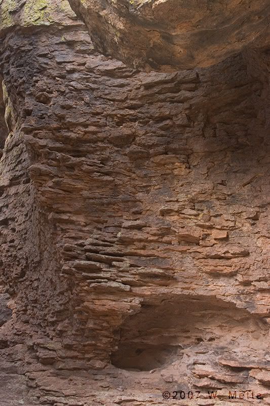
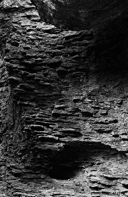
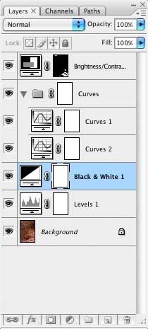
Here's what I did on the train this morning while riding to work. I've included the layers pallet of the Photoshop file as well. Note the layer mask on the brightness/contrast adjustment layer. I'm only using it to bring down the highlights in the lower-right and upper-left so that they're more in line with the remainder of the image. Sorry for the big files but I rotally suck at sharpening for anything less than 800px.
Drifting
Joined: Oct 2006
Posts: 2,683
Likes: 213
From: CA
Originally Posted by fdl
six, have you tried something like noiseninja? You lose some detail but it will help with noise.
Thread Starter
Racer
Joined: Oct 2003
Posts: 260
Likes: 0
From: Los Angeles, CA
Originally Posted by Billiam
Here's what I did on the train this morning while riding to work. I've included the layers pallet of the Photoshop file as well. Note the layer mask on the brightness/contrast adjustment layer. I'm only using it to bring down the highlights in the lower-right and upper-left so that they're more in line with the remainder of the image. Sorry for the big files but I rotally suck at sharpening for anything less than 800px.
Moderator Alumnus
Joined: Mar 2002
Posts: 64,207
Likes: 14,347
Originally Posted by fdl
I find that most people go overboard with pp. I prefer subtle changes, where it looks very natural. This is especially important when people are in the picture.
Over sharpening, over saturation, overly bright exposures, all look really bad to me and I find myself preferring the the original.
That said the examples posted here are not bad.
Over sharpening, over saturation, overly bright exposures, all look really bad to me and I find myself preferring the the original.
That said the examples posted here are not bad.
Moderator Alumnus
Joined: Mar 2002
Posts: 64,207
Likes: 14,347
Originally Posted by sixsixfour
what do you mean HDR?
Thread Starter
Racer
Joined: Oct 2003
Posts: 260
Likes: 0
From: Los Angeles, CA
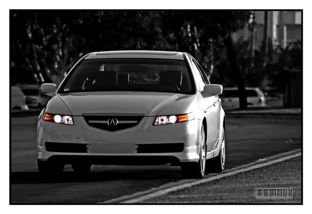
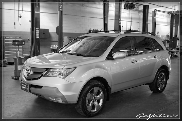
Here's another recent PP I did. It's of my wife's MDX. Let me know what you guys think, especially the grayscale conversion. It's my first attempt at it. I used Lightroom only for everything.
Before
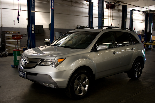
After
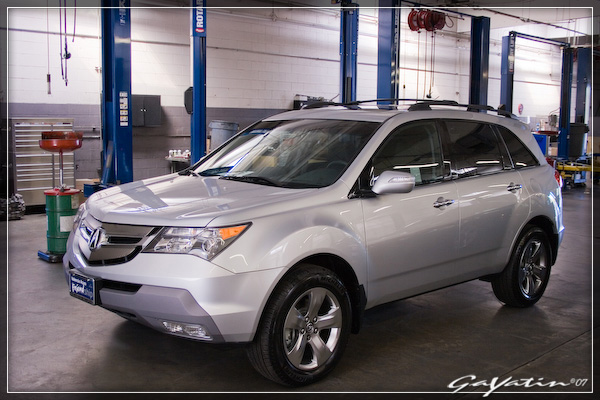
Grayscale Conversion
Before
After
Grayscale Conversion
Big Block go VROOOM!
Joined: Oct 2003
Posts: 8,578
Likes: 1
From: Chicago Burbs
Originally Posted by guia x
That is a nice b&w conversion. Are you using CS3? I don't recall seeing that Black and White adjustment layer in CS2. I've yet to do some b&w post processing.
Suzuka Master
Joined: Jul 2005
Posts: 6,777
Likes: 39
From: Virginia
man, I'm learning a bit here.
Now, here's question, what program should I use for PP. I have nothing right now, and I'm not a pro, so I don't need to spend a lot of cash. Should I just get someone with student ID to get a copy of LR academic, or go with CS? Throw me a bone here, please.
Now, here's question, what program should I use for PP. I have nothing right now, and I'm not a pro, so I don't need to spend a lot of cash. Should I just get someone with student ID to get a copy of LR academic, or go with CS? Throw me a bone here, please.
Safety Car
Joined: Aug 2004
Posts: 4,197
Likes: 16
From: NJ
Originally Posted by saiko_cl_duck
man, I'm learning a bit here.
Now, here's question, what program should I use for PP. I have nothing right now, and I'm not a pro, so I don't need to spend a lot of cash. Should I just get someone with student ID to get a copy of LR academic, or go with CS? Throw me a bone here, please.
Now, here's question, what program should I use for PP. I have nothing right now, and I'm not a pro, so I don't need to spend a lot of cash. Should I just get someone with student ID to get a copy of LR academic, or go with CS? Throw me a bone here, please.
Lightroom can be had for 90 bucks shipped with a student id.
Suzuka Master
Joined: Jul 2005
Posts: 6,777
Likes: 39
From: Virginia
Originally Posted by badboy
If you are new to pp, LR is going to be more than enough for processing your pictures to look better. On the other hand, if you want to edit your pictures to include/remove objects, LR will not do any of that, you're better off with any version of photoshop.
Lightroom can be had for 90 bucks shipped with a student id.
Lightroom can be had for 90 bucks shipped with a student id.
I noticed it's 90 shipped with student ID, problem is, I don't have one

Big Block go VROOOM!
Joined: Oct 2003
Posts: 8,578
Likes: 1
From: Chicago Burbs
Originally Posted by saiko_cl_duck
I don't want to chop pics, I just want to bring out the best in them.
Suzuka Master
Joined: Jul 2005
Posts: 6,777
Likes: 39
From: Virginia
hmmm, the post processing side of it really intrugues me, it's new to me, so I'm really interested in it. I would like to make my pictures not only look better, but be able to see what I can really do with them. I'm getting back into photography, I take it as a hobby, but one that's really rewarding. Make sense?
Are you suggesting PS then? Granted, I'm new to PP, so I would need something that isn't too damn techical, but I do learn quick.
Are you suggesting PS then? Granted, I'm new to PP, so I would need something that isn't too damn techical, but I do learn quick.
Im No Superman
Joined: Sep 2004
Posts: 4,226
Likes: 0
From: Arcadia, CA
Originally Posted by Billiam
Yep, that's the CS3 beta. There's a 3rd party product out there called "Convert to B&W Pro" that's the equivalent to the B&W adjustment layer. It's pretty expensive for what it is though. If you want to start messing around with conversions, you can use the built-in channel mixer feature in Photoshop. I find using it pretty tough though compared to the "dedicated" B&W tools.
The auto align and blend make panorama and stitching EASY I took a picture of my room and had it done in less than 5min Cant wait for CS3 retail
Is the photoshop software really that much better on Intel CPU computers? It makes me want to get an intel dualcore in the future instead of an AMD (which I have been loyal to just bc its cheaper)
Big Block go VROOOM!
Joined: Oct 2003
Posts: 8,578
Likes: 1
From: Chicago Burbs
Originally Posted by saiko_cl_duck
Are you suggesting PS then? Granted, I'm new to PP, so I would need something that isn't too damn techical, but I do learn quick.
BTW- Be aware that with Photoshop (and I assume Lightroom) Adobe locks you into academic editions forever once you go down that road. You can't use a retail upgrade on an academic edition product. I'm sure there's probably cracks around this but if you're considering actually purchasing the software, you're probably not the kind of preson that wants to rely on cracked applications.
Drifting
Joined: Oct 2006
Posts: 2,683
Likes: 213
From: CA
guia x,
with regard to the MDX, i like the pp'ing. however, my critiques are:
-subject looks a tad bit too bright. personally with the way the shot (and the subject) is, i think its hard to get around that without actually selecting parts of the MDX and tweaking each separately.
-subject isnt as saturated. i like the saturation of the original picture. then again, it just may be how the pp affects the subject.
thats about it. overall, thats a tough shot. i have some shots of my brother's car inside a garage like that and lighting (flourescent) is always tricky. props to the b/w shot - i like it!