Lexus: IS News
#1803
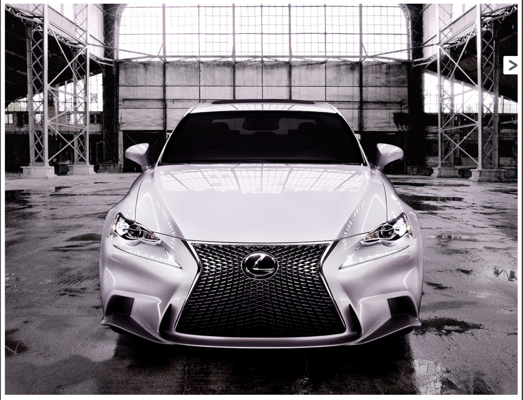
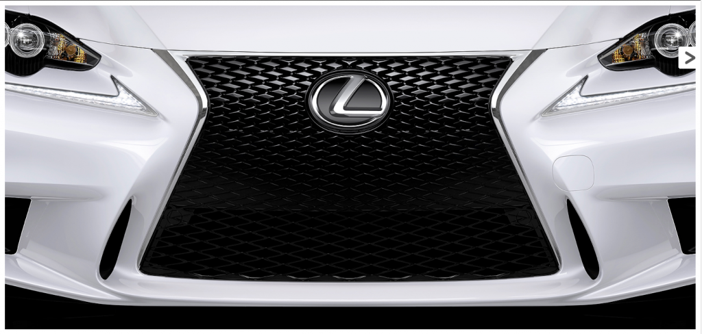
Just a heads-up : the new IS is supposedly going to be "unveiled" via pictures tomorrow. I'm expecting a predator grille, but can't wait.
http://blog.lexus.co.uk/2013/01/the-...s-almost-here/
http://blog.lexus.co.uk/2013/01/the-...s-almost-here/
#1805
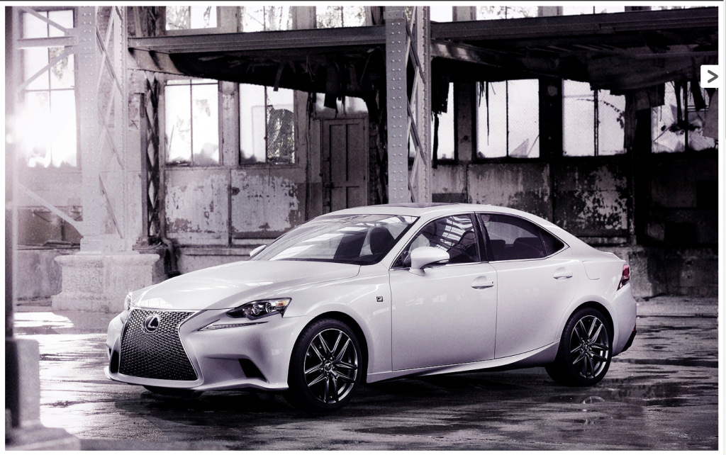
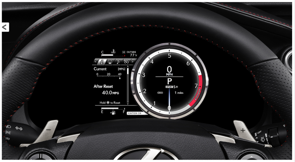
Wow, that stuck a lot closer to the concept than I thought it would. Interior is as I expected after seeing the ES, GS, & LS. However, love the LF-A inspired instrument cluster.
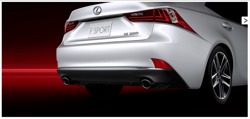
The only thing I don't like is how drawn out the taillamps are towards the front.
The only thing I don't like is how drawn out the taillamps are towards the front.
#1811
 WTF Lexus?
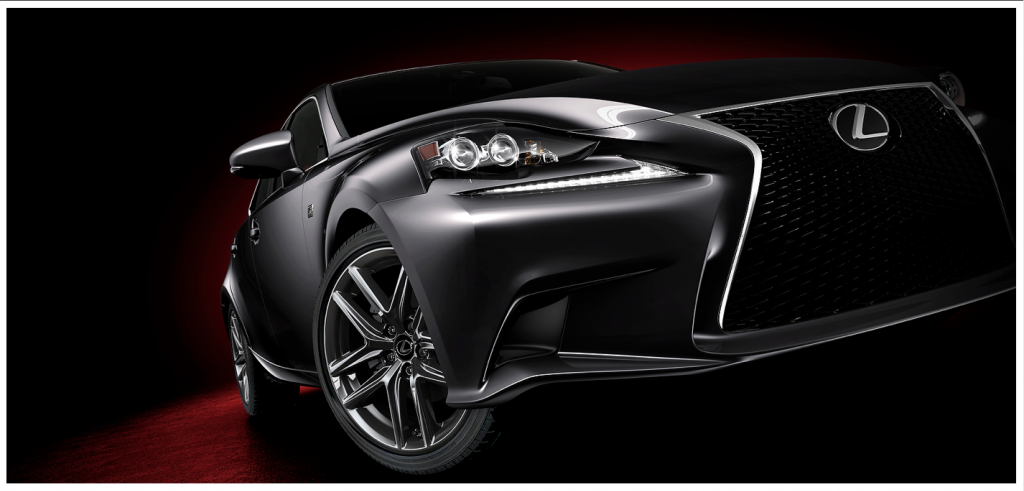
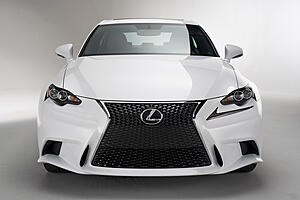
So many things wrong with the exterior of this car. From the side profile, it looks decent. Whoever designed the front lights on this thing deserves to be fired, immediately. Why the hell is the cliche LED light strip separated from the rest of the headlight assembly by a few inches of plastic? It just looks sloppy.
And well, there's the Predator/Darth Vader grille that Lexus loves for some reason, that was passable enough on the GS, but sticks out like a sore thumb here. I feel like I could use this thing in place of a Dust Buster.
Interior though, pretty standard Lexus fare, but still good. I'm so glad to see that Lexus isn't following the German's trend of "I'll just set my tablet down here" for the Nav/Infotainment system.
#1815
What is with that grille? I think if they would have just shaped the front in the trapezoid design but without extending the grille deign down the entire front, like on the RX, it would be a bit easier on the eyes. Other than that, I don't think it's that bad around the rest of the car. Interior isn't bad, even if I prefer a dial as a speedometer rather than a number. But if that cluster has all different modes to change to like the LFA, then maybe I could look past that 

#1817
I like it a lot...the exterior could have come out of the oven maybe 5 minutes sooner...but its got style. It sets itself apart in a good way.
NOTHING can make the 4G TL look good.
I really like this design.
NOTHING can make the 4G TL look good.
I really like this design.
#1818
What the hell is this thing?


#1821
Yes, agreed, this is aggressive in a good way. The 4G TL was horrible. One of the reasons why this works is because it has good RWD proportions, something the 4G TL design is begging for.
#1822
This has a large front overhang for a RWD car. Looks about the same length as the 2G TL's.
The following users liked this post:
AZP-TL (01-24-2013)
#1826
#1827
I could live without the scalloped headlights...and would prefer to see the LED strips integrated into the headlight design...but I like that they are trying something different.
The front chin spoiler is very aggressive...but the plate on the back also says F SPORT...so I'm guessing the majority of the ones we'll see will be a tad tamer.
I was thinking the rear taillights drew out and down too far...but I have to come really like that.
Lexus is going ballsy and taking risks....which I think is great coming from a company highly regarded as bland and safe for the last 20 years.
What was Acura's big risk in design? A bloated beak that everyone hates. The highly bloated looking ZDX or 4G TL???
The only other Japanese company taking design risks is Infiniti...and I personally have loved the last gen FX....but I like the current Z and I like the JX a lot.
#1830
wow! looks like shit
rear lower bumper looks hideous and trashy and the front looks like someone took a heat gun to it for far too long. interior looks nice and the tail lights are cool... but damn, this is disgusting
if this was an acura people would be urinating on this thread left and right.
in for major revision/very early MMC within 1-2 years
#1832
Wow. First impression is the design is way over the top. I can't find an exterior angle of this car that I like. The interior is "eh". The gauges/dash looks good from what I can tell. I'm still curious to see how it performs, though, and I'll probably still check it out in person. Now to wait a few days for the Q50, but if Infiniti holds to form, that thing's going to break my heart and look like a baby beluga whale.
More pics from Autoblog for those of you interested :
http://www.autoblog.com/photos/2014-...photo-5548004/
Now I get to wait a few days to see
More pics from Autoblog for those of you interested :
http://www.autoblog.com/photos/2014-...photo-5548004/
Now I get to wait a few days to see
#1834
 they gotta work on their design and RWD!!! As for the new IS its meh i feel Lexus has gone the wrong way these few years. Lexus used to be plain simply and luxury now its meh but i was never a lexus fan to begin with
Last edited by DaChef320; 01-09-2013 at 07:48 PM.
#1838
The GS is far, far from outdated looking. Out of all the cars, it's definitely the best looking of the line-up, with the LS right behind it.
Back to the car, I hadn't even noticed the headlight design. The only company that reminds me of is currently Pagani who did something somewhat similar in design.

Still very much looking forward to seeing it in the flesh, let alone driving one, when they come in. I imagine we'll have our unveiling when we move this summer if they're not out yet.
Back to the car, I hadn't even noticed the headlight design. The only company that reminds me of is currently Pagani who did something somewhat similar in design.

Still very much looking forward to seeing it in the flesh, let alone driving one, when they come in. I imagine we'll have our unveiling when we move this summer if they're not out yet.
#1839
I kinda like it. The more I look at it, the more it grows on me.
The front end does take some getting used to. Like Sarlacc said, Lexus should have integrated the front LED strips into the headlights. Oh, and the rear taillight shouldn't extend so far forward toward the front and down toward the rear wheel... but that's nothing a little white plasti-dip can't fix.
The front bumper probably could have done without the extra set of gills near the lower part of grille.
I love the interior though. Love the two tone look.
I'd definitely consider it if I was in the market for a new sedan.


