
Critique this picture


Safety Car


Joined: Feb 2004
Posts: 4,389
Likes: 490
From: Houston, Texas
Its a nice picture.
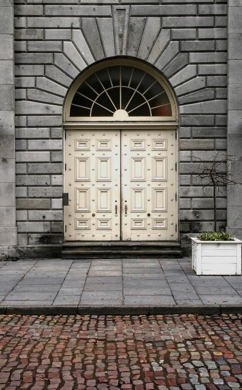
But I'm not too sure what the focus is. The door would be a natural choice. But what is it about this door? Are you trying to illustrate how powerful it is or how diminutive it is? Or maybe the texture of it is special. As of right now, the door doesn't "speak." This is also because the door is in the dead center of the picture. It would have been more effective if centered on one of the horizontal "third" lines.
I think the primary problem is that there is too much of a balance between the foreground and the wall/door. Therefore, the eye and mind does not immediately know what's going on. On first glance, the door attracts the eye. simply because its so bright. But the huge and busy expanse of ground is distracting. The two vertical columns that frame the sides also constrain the mind. The image feels cramped and busy. Again, due to a lack of focus.
These are only opinions of course. I look forward to seeing what others say.
Its an excellent picture in terms of exposure and mechanics.
I might say the most interesting subject would be that decrepit tree. Maybe something could have been worked out in relation to the boldness of the stone.

Photography Nerd
Joined: Sep 2003
Posts: 21,489
Likes: 11
From: Toronto
I think it's a good image, but the framing and cropping could use a little work. I think this shot would look best as a square crop with a little looser framing. Square crops are inherently "restful" but if with an interesting off-center object like the tree, it can be quite captivating. I really like the detail in the brickwork around the door and the light in the middle of the frame really draws in the viewer's eye.
Here are a few suggestions:

Lines are very important when shooting archetectural subjects. Try to keep parallel lines as parrallel as possible. This is why tilt & shift lenses are popular for this type of work.
Here are a few suggestions:
Lines are very important when shooting archetectural subjects. Try to keep parallel lines as parrallel as possible. This is why tilt & shift lenses are popular for this type of work.
Thread Starter
Safety Car
Joined: Aug 2004
Posts: 4,197
Likes: 16
From: NJ
Dan, an A for critique....
You suggest a square crop, does that mean the empty space on the left and right of the photo would just be a static color?
I really liked the added color of the bricks in the composition, but I guess that didn't really work. As for the parallel lines, I tried my best to get them as straight as possible, but as we can see, it didn't work out well.
Photography Nerd
Joined: Sep 2003
Posts: 21,489
Likes: 11
From: Toronto
For the square crop I recommended, you'd have to reshoot the shot so that there's something in the white areas at the side. You'd need to see the crop in your head before taking the shot next time.
You could probably salvage this shot by just cropping the bottom off, and using the free transform tool to get the lines parallel. The tight cropping on the right and the top won't go away, but the image proportions would be better.
You could probably salvage this shot by just cropping the bottom off, and using the free transform tool to get the lines parallel. The tight cropping on the right and the top won't go away, but the image proportions would be better.
Trending Topics
Big Block go VROOOM!
Joined: Oct 2003
Posts: 8,578
Likes: 1
From: Chicago Burbs
I agree with the square crop Dan suggested. Having said that though, I feel it's only "necessary" because of the planter/tree. If that were to have somehow magically not been there, then I think your framing is good as it is.
Keeping in my fictional sans-planter world, I would feel at this point the issue with the image is that it's lacking contrast. Interestingly though, it technically isn't. At least in terms of luminance contrast (lights & darks). Looking at the histogram reveals a healthy amount of data across the entire tonal range. The interesting part is that (other than the step below the door) your darks are all spread out in thin lines between the bricks. This doesn't really grab they eye and make the sort of "these are the shadow areas" statement that most of us are used to seeing in images.
Now having said all that, you have to keep in mind that contrast doesn't just have to be about luminance (lights and darks). You can also make images that the eye finds pleasing by having areas of contrasting color or texture. I think you have a good opportunity for using color contrast to make this image pop. If I were going to have a go a this image I would work on three areas:
First increasing the color saturation of the paver bricks in the street. Second, increasing the saturation of the door and window frame to bring out the gold hue. Third would be the facade bricks. I would decrease the color saturation (minus adjustment in hue/saturation) to make the gold colors of the door stand out but I would also increase the luminance contrast (plus adjustment in brightness/contrast) so that the various bricks in the facade contrasted with each other.
BTW - All of these types of tweaks require the use of layers and layer masks.
Big Block go VROOOM!
Joined: Oct 2003
Posts: 8,578
Likes: 1
From: Chicago Burbs
I was bored so I took a shot a the stuff I mentioned in the previous post. I hope badboy doesn't mind. The PS layers pallet of what I did is below. Note, several of the adjustment layers shown had their opacities turned down quite a bit.
The street bricks really should have had two different color balance adjustments. Most of them are still too yellow. When I adjusted them to look correct though, the street bricks in the lower right ended up looking too blue.

The street bricks really should have had two different color balance adjustments. Most of them are still too yellow. When I adjusted them to look correct though, the street bricks in the lower right ended up looking too blue.

Thread
Thread Starter
Forum
Replies
Last Post
08_UA7_Gr33k
Member Cars for Sale
13
Feb 11, 2016 02:17 PM
InFaMouSLink
Car Parts for Sale
3
Oct 30, 2015 09:43 AM
dainmezron
4G TL (2009-2014)
16
Oct 16, 2015 06:56 PM
lanechanger
Member Cars for Sale
4
Oct 13, 2015 10:56 AM