
**Black and White Only**

Earth-bound misfit
Joined: Mar 2006
Posts: 31,704
Likes: 608
I say this with complete honesty. I believe the most important part is making art that you enjoy. And enjoying the experience of making it. Possibly even growing from the experience of making it. That is, if art is your aim.
Of course, that all goes out the window if people are paying you.
Edit: I don't mean to imply that there isn't value in critique and that we shouldn't seek to improve our art. I just also think it's important not to get so bound up in trying to make things that will please a wide audience that we no longer enjoy making art for the sake of making art. Just thinking out loud. (And I agree with the critiques offered, fwiw.)
Last edited by wndrlst; Jan 29, 2014 at 02:04 PM.

Moderator Alumnus


Joined: Mar 2002
Posts: 63,857
Likes: 14,101

Thread Starter
Needs more Lemon Pledge
Joined: Mar 2005
Posts: 52,768
Likes: 2,000
From: Phoenix, AZ
Earth-bound misfit
Joined: Mar 2006
Posts: 31,704
Likes: 608
Originally Posted by stogie1020
The discussion over PTTL's bridge photo... Posts 65-78.
I hope for more of that type of discourse. I learn from it.
I hope for more of that type of discourse. I learn from it.
Generally, I liked this series in color because the fact that it's snow on the sand is a bit lost in B&W and the sky was a nice blue; but the contrast and shapes were so great for B&W that I couldn't resist converting a couple.
http://www.flickr.com/photos/moxiephotos/12211519114/http://www.flickr.com/photos/moxiephotos/12211519114/ by http://www.flickr.com/people/moxiephotos/, on Flickr
http://www.flickr.com/photos/moxiephotos/12211520944/http://www.flickr.com/photos/moxiephotos/12211520944/ by http://www.flickr.com/people/moxiephotos/, on Flickr
I'd also be curious to know which you prefer and why. Thanks!
Senior Moderator


Joined: Nov 2001
Posts: 20,067
Likes: 4,698
From: Cleveland area, OH
Italiano, time for a brief vacation from the forum.
Received multiple complaints about your behavior in the forum. I don't like to use the ban hammer, but what has been going on here has been unacceptable.
A week off to cool things down would be appropriate.
Received multiple complaints about your behavior in the forum. I don't like to use the ban hammer, but what has been going on here has been unacceptable.
A week off to cool things down would be appropriate.

Thread Starter
Needs more Lemon Pledge
Joined: Mar 2005
Posts: 52,768
Likes: 2,000
From: Phoenix, AZ
back to topic,
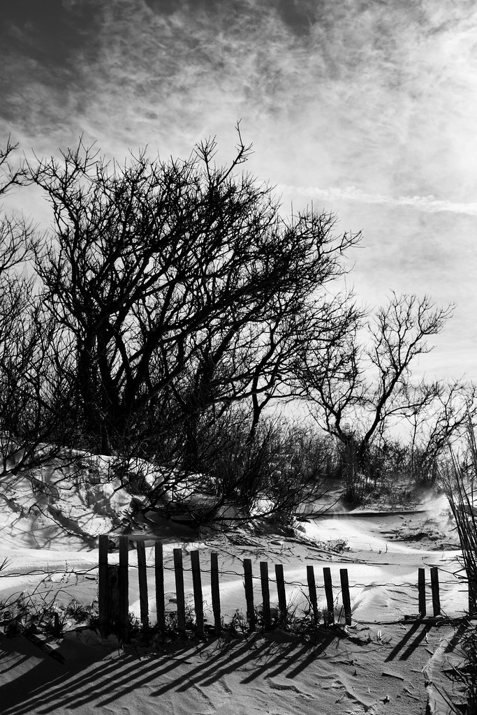
Wndr, I like the horizontal comp. I feel like many of the element in the pic are of a "sweeping" or "windswept" nature, and the wide comp allows for their figurative movement. I also feel like the negative space above the row of trees balances nicely with the bottom half of the image.
Cliffs: Me likey #1.
Moderator Alumnus
Joined: Mar 2002
Posts: 63,857
Likes: 14,101
I remember that, I just hadn't done that today, so I was wondering why you said that. I think maybe you were talking about Italiano (?)
My first Avatar....

Joined: May 2006
Posts: 32,437
Likes: 9,076
From: NJ

In the spirit of that, and of getting the thread back on track, I post these specifically for critique please.
Generally, I liked this series in color because the fact that it's snow on the sand is a bit lost in B&W and the sky was a nice blue; but the contrast and shapes were so great for B&W that I couldn't resist converting a couple.
20140129_Frohoboth Beach II_181.jpg by MoxiePhotos, on Flickr
I'd also be curious to know which you prefer and why. Thanks!
My first Avatar....
Joined: May 2006
Posts: 32,437
Likes: 9,076
From: NJ


Joined: Sep 2008
Posts: 78,234
Likes: 20,190
Wndr, thanks for the kind words...
I love the 2nd one for the shadows and interest too, but my eyes lit up at the first one for some reason.
Stogie, that was hilarious because you pretty much hit the nail on the head...he has a thread where he posts and bumps it incessantly with "..." to get response, I thought you were being funny
I love the 2nd one for the shadows and interest too, but my eyes lit up at the first one for some reason.
Stogie, that was hilarious because you pretty much hit the nail on the head...he has a thread where he posts and bumps it incessantly with "..." to get response, I thought you were being funny
My first Avatar....
Joined: May 2006
Posts: 32,437
Likes: 9,076
From: NJ
These are from a while ago too...
Don't have color of either one of these... "conceived" as BW for some reason.
<a href="http://www.flickr.com/photos/petshots/9446078644/" title="looking out sfx 0805 by ptcanon3ti, on Flickr"><img src="http://farm8.staticflickr.com/7445/9446078644_8a81600904_b.jpg" width="1024" height="683" alt="looking out sfx 0805"></a>
shot with my Sigma @ 500mm
<a href="http://www.flickr.com/photos/petshots/9571724664/" title="Hazy Philly at 500 BW 1528 by ptcanon3ti, on Flickr"><img src="http://farm6.staticflickr.com/5495/9571724664_8b3ae11d45_b.jpg" width="1024" height="683" alt="Hazy Philly at 500 BW 1528"></a>


The Third Ball
Joined: Sep 2002
Posts: 50,481
Likes: 5,865
From: Los Angeles, Ca
These are from a while ago too...
shot with my Sigma @ 500mm
<a href="http://www.flickr.com/photos/petshots/9571724664/" title="Hazy Philly at 500 BW 1528 by ptcanon3ti, on Flickr"><img src="http://farm6.staticflickr.com/5495/9571724664_8b3ae11d45_b.jpg" width="1024" height="683" alt="Hazy Philly at 500 BW 1528"></a>
shot with my Sigma @ 500mm
<a href="http://www.flickr.com/photos/petshots/9571724664/" title="Hazy Philly at 500 BW 1528 by ptcanon3ti, on Flickr"><img src="http://farm6.staticflickr.com/5495/9571724664_8b3ae11d45_b.jpg" width="1024" height="683" alt="Hazy Philly at 500 BW 1528"></a>
I would try and grade for a little more separation at the bottom of the frame. But I love the soft contrast of the buildings in the back ground...overcast day?


My first Avatar....
Joined: May 2006
Posts: 32,437
Likes: 9,076
From: NJ
No it was actually a beautiful day. I was so far away from those buildings that the haze from the city, Philadelphia, was clearly visible. The tugboat and barge in the foreground were probably halfway between me and center city.
The Third Ball
Joined: Sep 2002
Posts: 50,481
Likes: 5,865
From: Los Angeles, Ca
You can throw up a quick gradient filter to try and bring up the levels on the bottom more to bring out the detail/separation, and then add in a contrast to bring the blacks back a tad.
My first Avatar....
Joined: May 2006
Posts: 32,437
Likes: 9,076
From: NJ
^
Thanks for the suggestions! It's funny...when I was taking those shots i knew NOTHING about pp, not that i do now, but at least I understand what you're talking about now. lol I gotta go digging for that file.
Thanks for the suggestions! It's funny...when I was taking those shots i knew NOTHING about pp, not that i do now, but at least I understand what you're talking about now. lol I gotta go digging for that file.