
5280 Custom Car Show 2011

 02-11-2011, 01:25 AM
#42
Just my opinion, I like the guage more in this version and the carbon outline on the F, but I kinda like the "Fest" style more on your prior version. Any thoughts? Are you feeling this one more?
I dig like the sticker concept but wouldn't the primary logo be suitable for print? I mean screenprinters have very detailed pics on their apparel these days. It makes sense for hats stickers though.
Also, I dig the concept of incorporating things "colorado" but I think the red black and white combo looks fierce
so maybe for flyers and such, Kinkos (or another printing place) would be a good sponsor; even if say, they do the printing/copies at cost, instead of marked up
 02-11-2011, 07:47 AM
#44
Mile High
I was thinking about doing mountains in the background, and was playing around with it last night. I just couldn't come up with anything I was happy with. I will mess with that a lil more. It does needs to rep Colorado a lil better.
Scott, what about the old Fest do you like? Is it the "est" part or "F" itself or something else? I was liking the newer Fest a bit better, but I am not completely sold on it yet.
As for the different logo variations. I was thinking the Main logo can be used anywhere you want it to be: T-Shirts, Web-Site, Apparel, etc. The Print logo (like Matt said) would be used for anything we needed to be just in black and white to save $$$$. And the sticker application is obvious.
02-11-2011, 08:06 AM
#45
Mile High
www.cafepress.com
I use this place to print of t-shirts and other stuff every now and then. It can get to be pretty expensive on there, and we can probably get a better price (especially if you know someone local). But figured I would throw it out there. They don't charge extra for full color graphics.
I use this place to print of t-shirts and other stuff every now and then. It can get to be pretty expensive on there, and we can probably get a better price (especially if you know someone local). But figured I would throw it out there. They don't charge extra for full color graphics.
 the name!!!!!!
 02-12-2011, 12:15 PM
#48
in greeley, but i have never used them or heard of them though (so maybe ask scottie, since he is up there alot)
http://westviewprinting.com/
edit: or
http://www.dennisprintingservice.com/Graphic_Design.htm
and they are in boulder, so alot more local to where the meet is
http://westviewprinting.com/
edit: or
http://www.dennisprintingservice.com/Graphic_Design.htm
and they are in boulder, so alot more local to where the meet is
Last edited by friesm2000; 02-12-2011 at 12:17 PM.
 02-12-2011, 03:59 PM
#50
I like the mountains idea, not for the logo so much, too busy, but for the flyer I think it can look good. Here is what the flyer now looks like. I would do a comparasion with Digi's other logo but I don't have it yet.

The blank areas will feature a site map and vendor logos.
Thoughts?
Chris as for the logo I like the "est" best on this one simply because it think it flows better. Both F's are great but I also think this one flows a better too, but would like to see the CF around it. Not 100% on either and still open to suggestions so any other options are welcome as well.
This flyer will be the one I present at my meeting on Tuesday to secure the site so any last minute tweeks will have to occur before tomorrow night.
Last edited by Trendzero; 02-12-2011 at 04:02 PM.
02-12-2011, 07:17 PM
#51
i was thinking also with it possibly being too "busy" also in the background, as said previously there is a fine line between enough info, and having it too crowded
also scott, i know a couple of people who more then likely would be willing to had out fliers at their jobs (maybe free admission for them or something; or a couple of free raffle tickets if one is done; or something along those lines) to prospective attendees
also scott have you ever eaten at the http://www.thelube.com/main.html?utm...ign=SplashPage
(hint: look at their locations, let alone them being an automotive related place to eat)
02-12-2011, 10:14 PM
#53
i was thinking also with it possibly being too "busy" also in the background, as said previously there is a fine line between enough info, and having it too crowded
also scott, i know a couple of people who more then likely would be willing to had out fliers at their jobs (maybe free admission for them or something; or a couple of free raffle tickets if one is done; or something along those lines) to prospective attendees
also scott have you ever eaten at the http://www.thelube.com/main.html?utm...ign=SplashPage
(hint: look at their locations, let alone them being an automotive related place to eat)
also scott, i know a couple of people who more then likely would be willing to had out fliers at their jobs (maybe free admission for them or something; or a couple of free raffle tickets if one is done; or something along those lines) to prospective attendees
also scott have you ever eaten at the http://www.thelube.com/main.html?utm...ign=SplashPage
(hint: look at their locations, let alone them being an automotive related place to eat)
02-12-2011, 11:09 PM
#55
i think it adds too much black at the right side  , but as said before i am no graphic artist
  (btw i think you change the skyline to Denver, which if so i like)
also i think that civic type-R needs to go and be replaced with another car, one that we can actually get here
as far as the wing place; they are actually pretty decent wings too, wife normally hates most wings out here in Colorado (being from buffalo), but actually likes them there
whatever i like the hostesses or some of the bartender's; O... the cars/motorcycles i like too 
also don't forget to order yourself a Lube Tube when you go there for yourself
, but as said before i am no graphic artist (btw i think you change the skyline to Denver, which if so i like)also i think that civic type-R needs to go and be replaced with another car, one that we can actually get here
as far as the wing place; they are actually pretty decent wings too, wife normally hates most wings out here in Colorado (being from buffalo), but actually likes them there
whatever i like the hostesses or some of the bartender's
; O... the cars/motorcycles i like too also don't forget to order yourself a Lube Tube when you go there for yourself

 02-13-2011, 02:53 PM
#57
Mile High
Scott, I think the flyer looks great. But maybe lighten up the background image. Make the opacity of it more like 60-50%. I think it distracts from the text a little bit. Also, the small text that is in black is a little hard to read. Maybe try taking off the outline?
Lemme know if you need anything else changed on the logo.
Lemme know if you need anything else changed on the logo.


 02-14-2011, 07:21 AM
#61
Mile High
 02-15-2011, 10:51 PM
#67
So here's the update:
Meeting went great tonight and we officially have a location, a food and beverage provider, permitting, some start up cash for the website and other startup costs and liablity insurance The rest is now up to the 5280fest promotional team.
Chris I will be giving you a call soon so you me and another can meet to map this out.
Here is the updated flyer with location and our first sponsor.
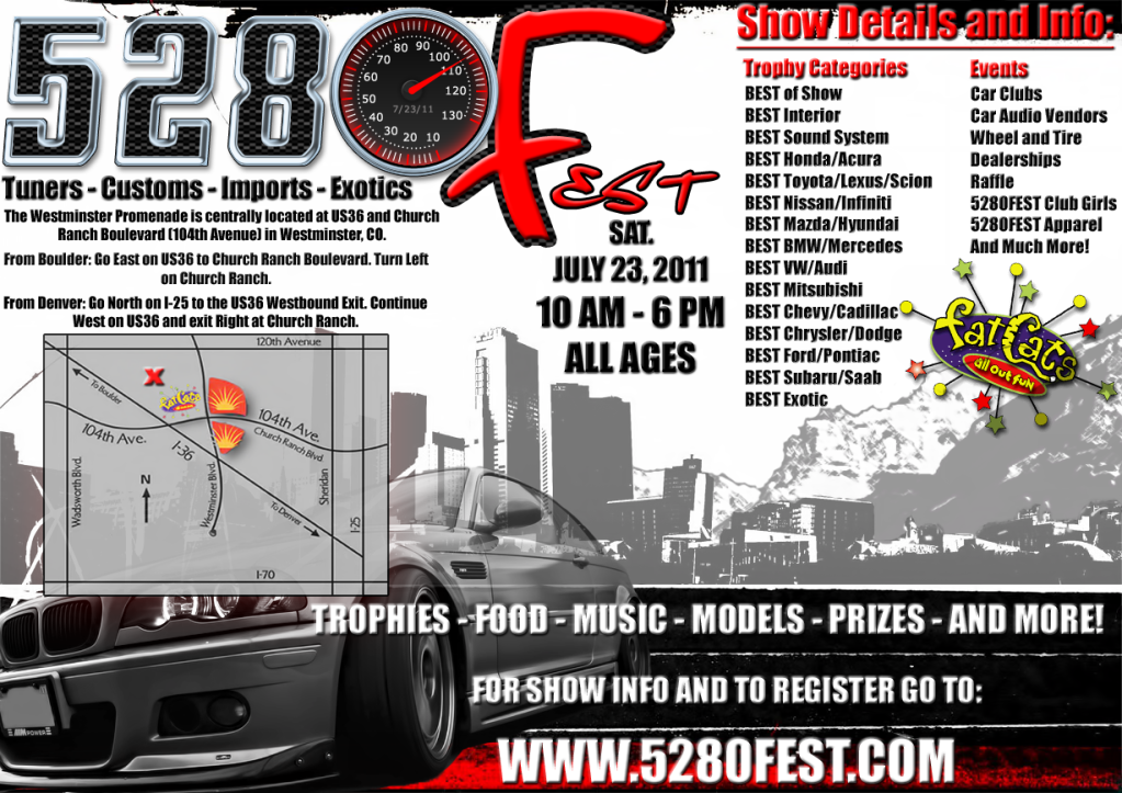
Meeting went great tonight and we officially have a location, a food and beverage provider, permitting, some start up cash for the website and other startup costs and liablity insurance
The rest is now up to the 5280fest promotional team.Chris I will be giving you a call soon so you me and another can meet to map this out.
Here is the updated flyer with location and our first sponsor.
02-16-2011, 12:13 AM
#69
So Chris, myself and another non-Azine member are the 3 core individuals putting this project together BUT for the rest of you whom have been participating on this thread:
Hockeyman,
Souljah,
gfrg88,
timberland,
Friesm,
tc5280,
Scottayhifive.
I have appreciated your input, feedback and continued help, wheather very small or large.
For your continued support in promoting this event I will:
1. Waive your registration fees for the judging group;
2. Give you each two raffle tickets; and
3. Give one 5280fest shirt or hat to you.
This offer is only for those listed here and because it is going to cost a lot of money to put this event together and I can't afford to extend "freebies" to others.
I will most likely still give some type of AcuraZine discount or something similar for the other mile high region members.
02-16-2011, 12:19 AM
#70
Sweet....
btw any wet t-shirt contest to judge?
also is it "the lube" for the food and beverage"
edit: looks ti actually maybe be FAT CATS
also on that map, you may want to make an insert of it, with better a better map of the "parking lot", not exactly the easiest one to navigate
btw going to need stickers for the car too (except gio )
)
btw any wet t-shirt contest to judge?
also is it "the lube" for the food and beverage"
edit: looks ti actually maybe be FAT CATS
also on that map, you may want to make an insert of it, with better a better map of the "parking lot", not exactly the easiest one to navigate
btw going to need stickers for the car too (except gio
)
Last edited by friesm2000; 02-16-2011 at 12:23 AM.
02-16-2011, 12:27 AM
#71
Mile High
Awesome job Scott! I am really impressed with how smoothly this has all gone so far, great work
I am really excited to be a part of all this I will PM you with my number. Congrats on makin' this a reality!
I am really excited to be a part of all this I will PM you with my number. Congrats on makin' this a reality!