
Post Processing Thread
 04-13-2007 | 07:04 PM
#42
Have camera, will travel
Joined: Jan 2004
Posts: 7,783
Likes: 0
From: Federal Way, WA
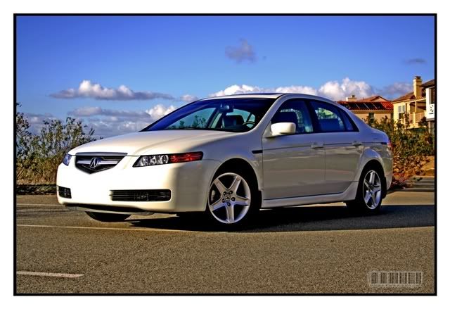
The images look good, but the last one is a tad on the contrasty side for my tastes The saturation looks a little overdone as well. On the last shot you could even pop a little flash on the shaded side for a more balanced exposure, but that's a personal taste thing. It's a good trick to have in your tool bag though. 
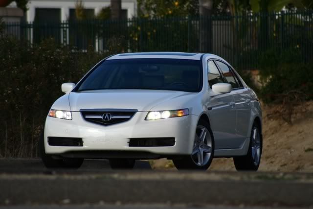
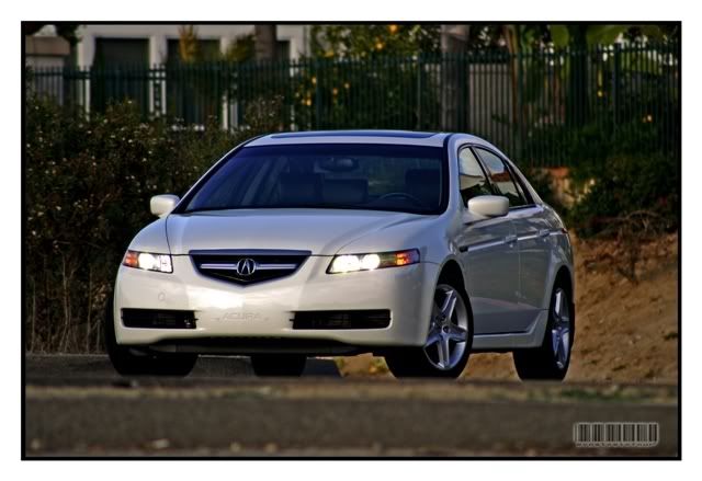
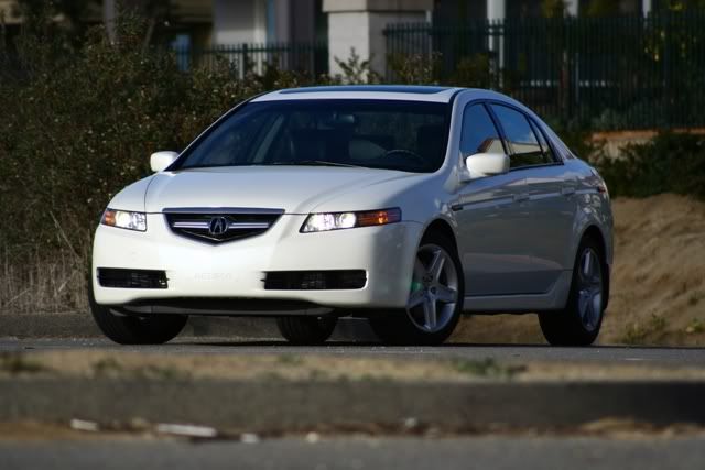
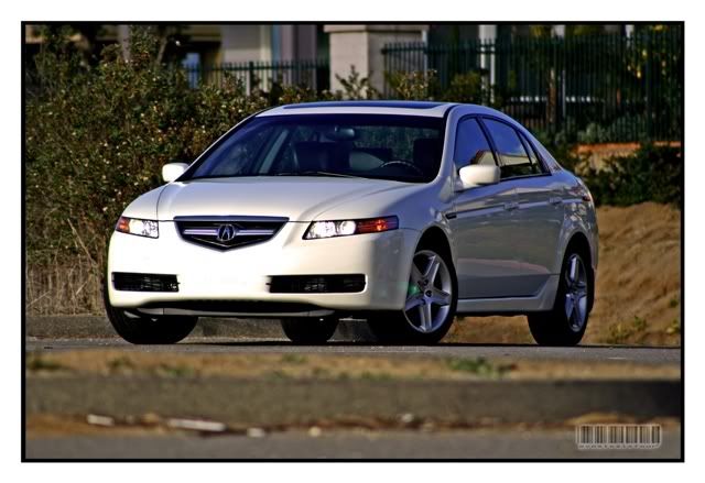
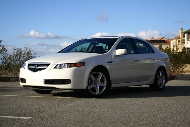
Sweet car.
Sweet car.

 04-14-2007 | 03:29 PM
#44

Advanced
Joined: Oct 2006
Posts: 79
Likes: 0
Originally Posted by sixsixfour
guia x,
with regard to the MDX, i like the pp'ing. however, my critiques are:
-subject looks a tad bit too bright. personally with the way the shot (and the subject) is, i think its hard to get around that without actually selecting parts of the MDX and tweaking each separately.
-subject isnt as saturated. i like the saturation of the original picture. then again, it just may be how the pp affects the subject.
thats about it. overall, thats a tough shot. i have some shots of my brother's car inside a garage like that and lighting (flourescent) is always tricky. props to the b/w shot - i like it!
04-15-2007 | 12:17 AM
#45
Drifting
Joined: Oct 2006
Posts: 2,683
Likes: 212
From: CA
Originally Posted by tsx_07
this is a great thread guys. i have one question for you sixsixfour, what did you use for PP your photos? your photos looks lot sharper and detailed after PP. If you use CS2, what feature(s) you use? i am a novice photographer and although i managed to get my hands on a PS CS2, i found it very difficult to use/understand. I admit I have not spend much time with it yet..
my advice would be to find out what aspect of your photo do you want to stand out most. with that in mind, start playing around with the settings in CS2 until you *like what you see*. that *thing* is going to be your style. all you then do is refine it each time you shoot and your pictures will have a certain look to them that only you can do
good luck
 04-15-2007 | 03:31 AM
#46
Drifting
Joined: Sep 2004
Posts: 3,138
Likes: 4
From: 808
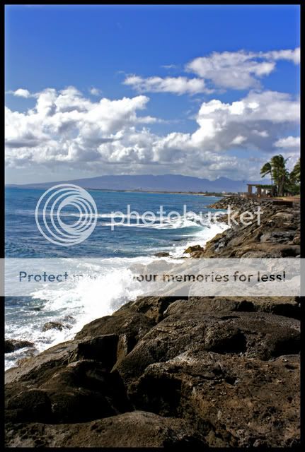
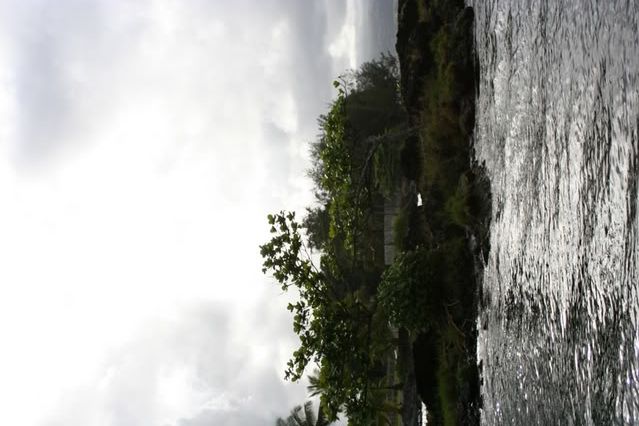
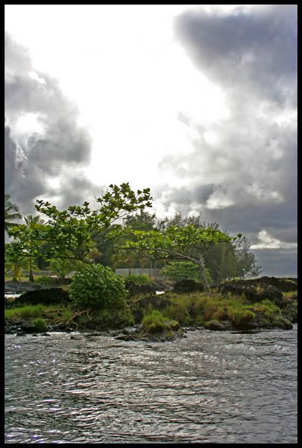
I just started playing w/ CS2 a while ago. I think my pictures come out a little fake looking, but I kind of like that for landscapes. I'm curious how they look on other monitors because i know mine isn't calibrated at all, and all I have is my 12" laptop.
here's just a few examples
before
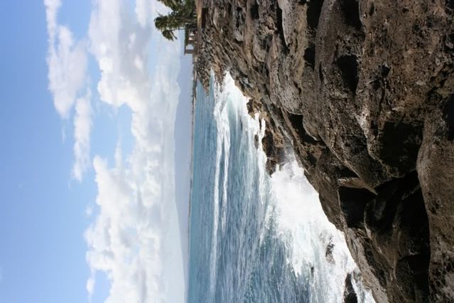
after
This next one i know looks too fake for my taste, but I didn't like the original picture at all. I forget why I even bothered to try and salvage it. Also I think now that I look at it, it could've used a bit of a cropping, but I dunno, I'm still learning.
before
after
I want to try out HDR, but I think I would need a tripod first
here's just a few examples
before
after
This next one i know looks too fake for my taste, but I didn't like the original picture at all. I forget why I even bothered to try and salvage it. Also I think now that I look at it, it could've used a bit of a cropping, but I dunno, I'm still learning.
before
after
I want to try out HDR, but I think I would need a tripod first
 04-17-2007 | 01:56 AM
#49
Thread Starter
Racer
Joined: Oct 2003
Posts: 260
Likes: 0
From: Los Angeles, CA
Originally Posted by sixsixfour
guia x,
with regard to the MDX, i like the pp'ing. however, my critiques are:
-subject looks a tad bit too bright. personally with the way the shot (and the subject) is, i think its hard to get around that without actually selecting parts of the MDX and tweaking each separately.
-subject isnt as saturated. i like the saturation of the original picture. then again, it just may be how the pp affects the subject.
thats about it. overall, thats a tough shot. i have some shots of my brother's car inside a garage like that and lighting (flourescent) is always tricky. props to the b/w shot - i like it!
with regard to the MDX, i like the pp'ing. however, my critiques are:
-subject looks a tad bit too bright. personally with the way the shot (and the subject) is, i think its hard to get around that without actually selecting parts of the MDX and tweaking each separately.
-subject isnt as saturated. i like the saturation of the original picture. then again, it just may be how the pp affects the subject.
thats about it. overall, thats a tough shot. i have some shots of my brother's car inside a garage like that and lighting (flourescent) is always tricky. props to the b/w shot - i like it!
Originally Posted by sixsixfour
here are a few, slightly older shots of my car that i would like to get everyone else's opinion on what to improve, change, etc...
thanks!
thanks!
Originally Posted by badboy
Here is something I did using Lightroom:
I know it's a boring picture, but any cc is appreciated on pp.
I know it's a boring picture, but any cc is appreciated on pp.
Originally Posted by Osamu
I just started playing w/ CS2 a while ago. I think my pictures come out a little fake looking, but I kind of like that for landscapes. I'm curious how they look on other monitors because i know mine isn't calibrated at all, and all I have is my 12" laptop.
here's just a few examples
This next one i know looks too fake for my taste, but I didn't like the original picture at all. I forget why I even bothered to try and salvage it. Also I think now that I look at it, it could've used a bit of a cropping, but I dunno, I'm still learning.
I want to try out HDR, but I think I would need a tripod first
Originally Posted by cl_jay
Well, I tried LightRoom out. Even though I have only used it once, I really like it. So like always C&C welcome. If you don't think it's good, tell me why. I need the help.
Anyway, I just want to say that I made some comments on here where everything is based on my own perception. I am not one bit the most experienced at post processing (hence why I started the thread). I hope people who are more experienced can come here and point out anything that I might have said that might mislead anyone. One thing I would want is to give out the wrong accessment on someone's work. We are all looking to improve our work. I don't want to say something to make them go backwards. So please if I say something wrong, point it out.


 03-22-2008 | 11:49 AM
#59
Drifting
Joined: Oct 2006
Posts: 2,683
Likes: 212
From: CA
Originally Posted by rimz
no, each post-processed pic was made from one image (the before pic)...
i used photomatix pro then finished it up with photoshop...
and thanks...
i used photomatix pro then finished it up with photoshop...
and thanks...
03-22-2008 | 12:26 PM
#60
now with four rings
Joined: May 2006
Posts: 1,745
Likes: 0
From: Bixby, OK
Originally Posted by sixsixfour
your pic of the front quarter shot is timeless
04-18-2008 | 01:07 AM
#61
Senior Moderator
Joined: Mar 2002
Posts: 59,005
Likes: 10,999
From: Chicago
I had lost my Stofen diffuser... so I fired this shot, and it only lit up her arm and hand. I was like  because it looked like the shot had come out nice, except for being poorly lit. Anyways I was pretty happy with how much I was able to recover.
Original shot/after PP:


btw got another diffuser a few days ago.
because it looked like the shot had come out nice, except for being poorly lit. Anyways I was pretty happy with how much I was able to recover.Original shot/after PP:
btw got another diffuser a few days ago.
04-18-2008 | 01:32 AM
#63
Senior Moderator
Joined: Mar 2002
Posts: 59,005
Likes: 10,999
From: Chicago
Originally Posted by Mizouse
im guessing her arm got blown out so you had to crop it out?
anyways thats cuhhraaazzzzzzzzyyy...!
anyways thats cuhhraaazzzzzzzzyyy...!
 . I tried a selection of everything except the lit portion but that didn't look right because brightening a dark area in PP does not give the same effect as a flash.
04-18-2008 | 01:40 AM
. I tried a selection of everything except the lit portion but that didn't look right because brightening a dark area in PP does not give the same effect as a flash.
04-18-2008 | 01:40 AM
#64
Moderator
Joined: Oct 2004
Posts: 63,321
Likes: 2,813
From: Not Las Vegas (SF Bay Area)
although i heard that it is better to underexpose than overexpose because if you overexpose there really isnt much you can do the save it. 
i wish i had mad crazy PP skills like you.
i wish i had mad crazy PP skills like you.
04-18-2008 | 02:07 AM
#65
Senior Moderator
Joined: Mar 2002
Posts: 59,005
Likes: 10,999
From: Chicago
yeah I don't know how you're "supposed" to do it but I *TOTALLY* prefer under vs. over. Sometimes I'll get an over shot and I just can't get it to look natural, at least as easily as I can get an under.
And the PP on the above shot wasn't too tricky - use curves to lighten from the middle without blowing out highlights, then run NR. Repeat this again about 2-3 times, and then I got the above shot - minus the brushing etc. Curves is AMAZING - you can use it to fix lighting in pretty much any shot. I could have run color correction on the shot but I chose not to - I thought it looked more natural without it.
And the PP on the above shot wasn't too tricky - use curves to lighten from the middle without blowing out highlights, then run NR. Repeat this again about 2-3 times, and then I got the above shot - minus the brushing etc. Curves is AMAZING - you can use it to fix lighting in pretty much any shot. I could have run color correction on the shot but I chose not to - I thought it looked more natural without it.

 04-28-2008 | 09:58 PM
#68
Big Block go VROOOM!
Joined: Oct 2003
Posts: 8,578
Likes: 1
From: Chicago Burbs
I took some images from a Winter trip and started fooling around with Matt Kloskowski's "Surreal Edgy Look" Lightroom presets. These presets are definitely not for every image in your LR catalog. For some though, these presets can take completely meh frames and make them pretty exciting. At least I think so.
1024 versions available at the Flickr set if you're interested.
http://www.flickr.com/photos/billiam...7604788976867/


1024 versions available at the Flickr set if you're interested.
http://www.flickr.com/photos/billiam...7604788976867/
 05-05-2008 | 11:35 AM
#71
Senior Moderator
Joined: Jan 2001
Posts: 34,937
Likes: 638
From: Chicago Burbs
Can someone help me with a picture? Im terrible at processing and this is the only picture I have of my grandfather.
He just passed away yesterday (he was 95) and this picture was just taken only a few months ago. So i would like it cleaned up as much as possible and get it printed. I know its blurry but its all i have to work with.
Please dont make fun of how he looks, he was sick in the picture.
http://farm3.static.flickr.com/2396/...de037262_o.jpg
05-05-2008 | 12:36 PM
#72
Have camera, will travel
Joined: Jan 2004
Posts: 7,783
Likes: 0
From: Federal Way, WA
Originally Posted by Crazy Sellout
Can someone help me with a picture? Im terrible at processing and this is the only picture I have of my grandfather.
He just passed away yesterday (he was 95) and this picture was just taken only a few months ago. So i would like it cleaned up as much as possible and get it printed. I know its blurry but its all i have to work with.
Please dont make fun of how he looks, he was sick in the picture.
http://farm3.static.flickr.com/2396/...de037262_o.jpg
He just passed away yesterday (he was 95) and this picture was just taken only a few months ago. So i would like it cleaned up as much as possible and get it printed. I know its blurry but its all i have to work with.
Please dont make fun of how he looks, he was sick in the picture.
http://farm3.static.flickr.com/2396/...de037262_o.jpg
http://www.flickr.com/photos/2727380...42701/sizes/l/
05-05-2008 | 04:55 PM
#73
Earth-bound misfit
Joined: Mar 2006
Posts: 31,704
Likes: 608
Here is my attempt...
<a href="http://www.flickr.com/photos/moxiephotos/2468430429/" title="Sellout's grandpa copy.jpg by wndrlst, on Flickr"><img src="http://farm3.static.flickr.com/2291/2468430429_7ed657fbf0_b.jpg" width="1024" height="683" alt="Sellout's grandpa copy.jpg" /></a>
I'm sorry about your grandpa.
<a href="http://www.flickr.com/photos/moxiephotos/2468430429/" title="Sellout's grandpa copy.jpg by wndrlst, on Flickr"><img src="http://farm3.static.flickr.com/2291/2468430429_7ed657fbf0_b.jpg" width="1024" height="683" alt="Sellout's grandpa copy.jpg" /></a>
I'm sorry about your grandpa.
 05-05-2008 | 05:17 PM
#76
Have camera, will travel
Joined: Jan 2004
Posts: 7,783
Likes: 0
From: Federal Way, WA
If you have a specific print size in mind, the shot can be cropped to that size, 5x7, 8x10, etc. That'll save you from having to chop out even more when you go to print it. Your granddad looked like a nice man.
05-05-2008 | 05:22 PM
#77
Senior Moderator
Joined: Jan 2001
Posts: 34,937
Likes: 638
From: Chicago Burbs
Im looking for a 8x10 print.
http://forums.slickdeals.net/showthread.php?t=805803
My grandfather would be proud that I found a good deal.
Unless anyone know of another service that is better than Walgreens.
http://forums.slickdeals.net/showthread.php?t=805803
My grandfather would be proud that I found a good deal.
Unless anyone know of another service that is better than Walgreens.
Last edited by Crazy Bimmer; 05-05-2008 at 05:25 PM.
05-05-2008 | 05:26 PM
#78
Earth-bound misfit
Joined: Mar 2006
Posts: 31,704
Likes: 608
Originally Posted by waTSX
If you have a specific print size in mind, the shot can be cropped to that size, 5x7, 8x10, etc. That'll save you from having to chop out even more when you go to print it. Your granddad looked like a nice man.
your skin tones are better. I completely spaced on white balance.
05-05-2008 | 06:37 PM
#79
I took wndrlst's version and just got rid of some more the yellow/green hues going on in the photo.
<a href="http://www.flickr.com/photos/86064761@N00/2468669165/" title="2468430429_7ed657fbf0_b_2 by graphicvision1, on Flickr"><img src="http://farm3.static.flickr.com/2221/2468669165_ee410a555a.jpg" width="500" height="400" alt="2468430429_7ed657fbf0_b_2" /></a>
I also recropped it so that it's saved at 8"x10" at 100dpi. Here's the link for the full size image:
http://farm3.static.flickr.com/2221/...cb6f96c9_o.jpg

